Enterprise B2B · 2023 — 2025
AVROID
The brief was: fix the logo and the palette.
What it became: a brand foundation argued through with the company’s leadership, a marketing site rebuilt and shipped, two design systems, template systems used across a 200-person company, and the visual layer of the products themselves.
01 — The brief
Two symptoms, and no system under them.
Fix the logo, fix the palette: that was the whole brief. The route from there to a design system was my own, and it began with explaining to leadership what a design system was and why AVROID needed one.
AVROID built mobile software for large corporate clients, with products running on Aurora OS. It had around 50 people when I joined and around 200 by the time I left. I was the only designer on the brand and the marketing site; one other designer worked on the mobile products. I had no reports, so what authority I had came from craft and from direct access to the CEO and the stakeholders funding the work.
Neither the mark nor the brand around it sat on anything:
- The wordmark had been traced from a typeface rather than drawn, and at large sizes it showed: wobbling edges, no shared cap line, corners of one kind drawn to different radii.
- There was no visual system, no positioning, no defined audience, and no written rules for anyone else to work from.
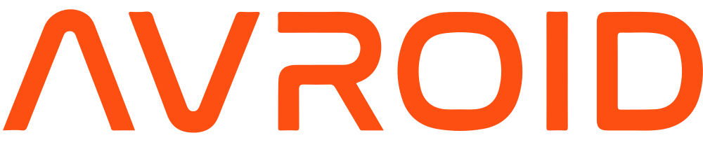


The marketing site had the same problem. None of this needed a metric to see:
- It opened with a three-line headline about a development toolkit, and one of the two buttons under it asked visitors to send a CV.
- Early blocks went to job openings, though hiring ran entirely through an external job board.
- On mobile, roughly a fifth of the screen was a blank white strip and the whole layout sat shifted to one side.


The previous site, from an archived snapshot of 29 June 2023 — desktop, and the same page at mobile width
02 — The room
The argument about the logo was not about the logo.
I brought three directions, separated by how far each one went into the mark. The first kept it exactly as it was, as I had been asked to. The second redrew it on a modular grid with sharp corners. The third used the same grid with rounded corners, softer and more approachable.
The room was the CEO, the head of product and the three stakeholders funding the project, and it went badly at first. One stakeholder saw no objective problem with the logotype and read the whole proposal as a designer’s personal taste.
The objection was fair: I had asked how far to go before anyone had agreed that anything needed to move. So I stopped arguing for a direction and started establishing the problem.
- The wordmark had come from an outside contractor, traced from a paid typeface the company had never licensed. That was a liability, not a preference.
- The mark broke down across sizes and media, and I put the real carriers on the table rather than describing them.
A room that has not agreed there is a problem cannot choose between solutions to it.
Only then did I argue the directions, on consistency, recognition and how far each could scale: terms the business already used.
The third was approved and set the tone for everything built afterwards. The company also bought the typeface licence. The new mark was reworked far enough to stand on its own, so for the mark the licence was a safeguard; its real job was making everything already in circulation on the old mark legal to keep using. A problem I had been hired to treat as a visual one turned out to have a legal half, and both halves closed in the same meeting.
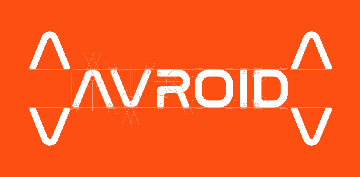
The reworked wordmark on its modular grid
Then came the brandbook, a modular grid for the mark, an advertising grid, the palette, patterns, iconography and merch, and written rules that let the team and outside contractors use it all without me in the room.



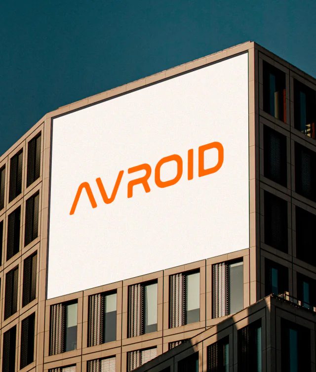
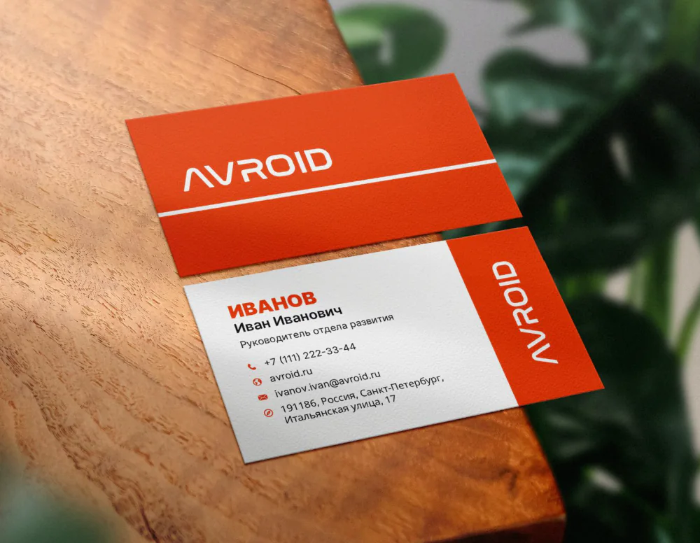
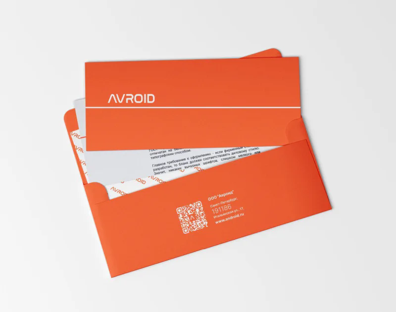
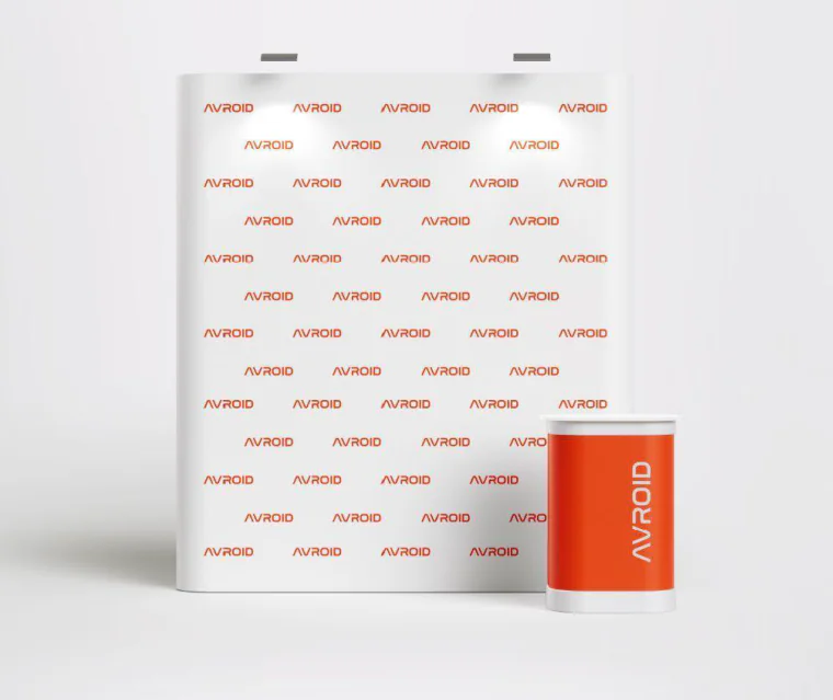
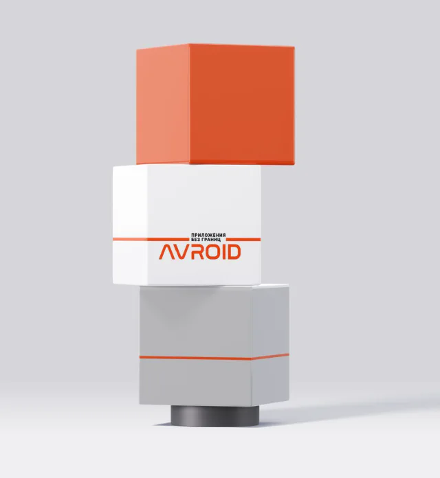
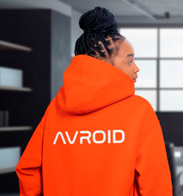
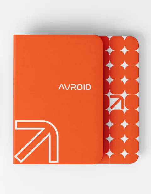
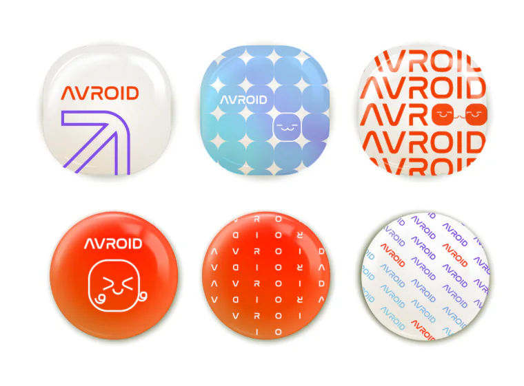
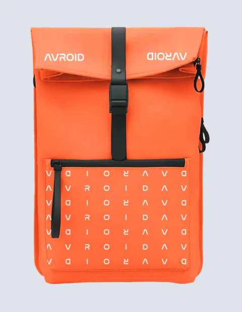
From the brandbook: the advertising grid and pattern, stationery, event carriers and merch
03 — The site
Three directions, tested before anything was built.
The analytics said where it hurt most. The heaviest drop-off was at the fourth block, “Our Projects”, where dense copy lost visitors before the plain product explanation further down. Around 40% of the traffic arrived on mobile, the very audience the broken layout was failing.
After researching the B2B segment, I built three full directions, around 45 concept screens in all: restrained and corporate, technical and functional, and graphically bold. The site map and user flows sat under all three as one UX layer.
Then structured concept testing: key employees and decision-makers first, then 10–15 people at active client companies, reached through sales and the CTO. All three went in the same presentation format. Participants were asked which they trusted, which read most easily and which felt most workable, and why. The decision came from recurring arguments, not from counting votes.
No developers were allocated, so I built the site myself. The copy was written with a copywriter; I pushed for short, visually supported messaging, and most of the text changes went through.
What changed after launch
Measured by me in Yandex Metrica, the autumn after launch against the autumn before it:
- Enquiry conversion up by around 18%.
- Visitors reaching the key product pages up by around 25%.
- Average time on site up by around 20%.
- On the main landing pages, the share of visits that ended within fifteen seconds on a single page fell from 54% to 43%.
One more signal came from sales, not analytics: enquiries asking what the company actually offered dropped by about a third, and first sales calls got shorter.

The shipped site
04 — Systems and scale
Systems, so departments stopped queueing on me.
By the time AVROID reached 200 people, it was producing decks, contracts, banners and email every day, and with one designer on the brand, all of it queued on me. The answer was systems other people could run.
Two design systems, built from scratch: one for the web, one for the brand, used by marketing and at times by the product designer. On the product design system I contributed rather than owned, reconciling new elements with the Aurora OS requirements.
Then templates for everyone: a presentation theme for the company deck and for conference, hardware and product decks; thirteen document templates with a written guide; eighty-three HTML5 banners; greeting cards, HTML emails and the email signature. Departments produced their own material, on brand, without a designer in the loop.
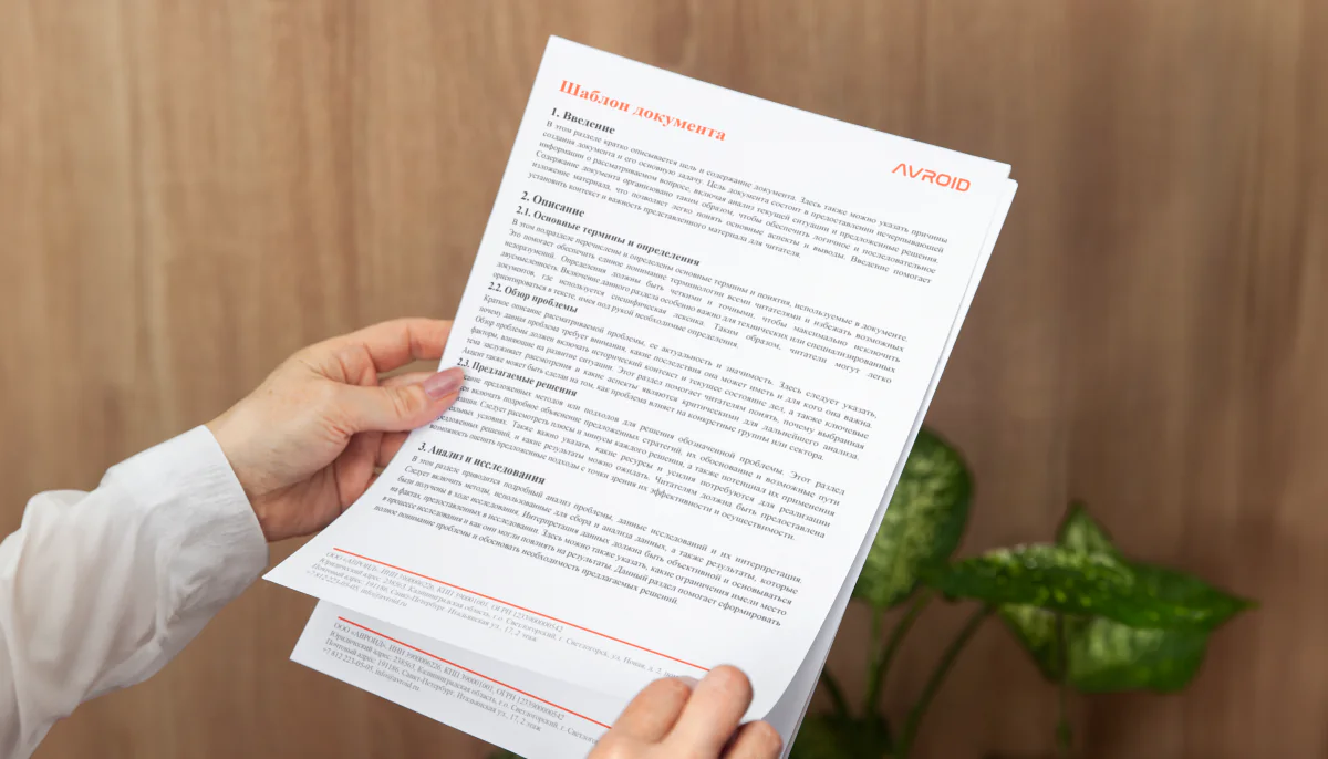
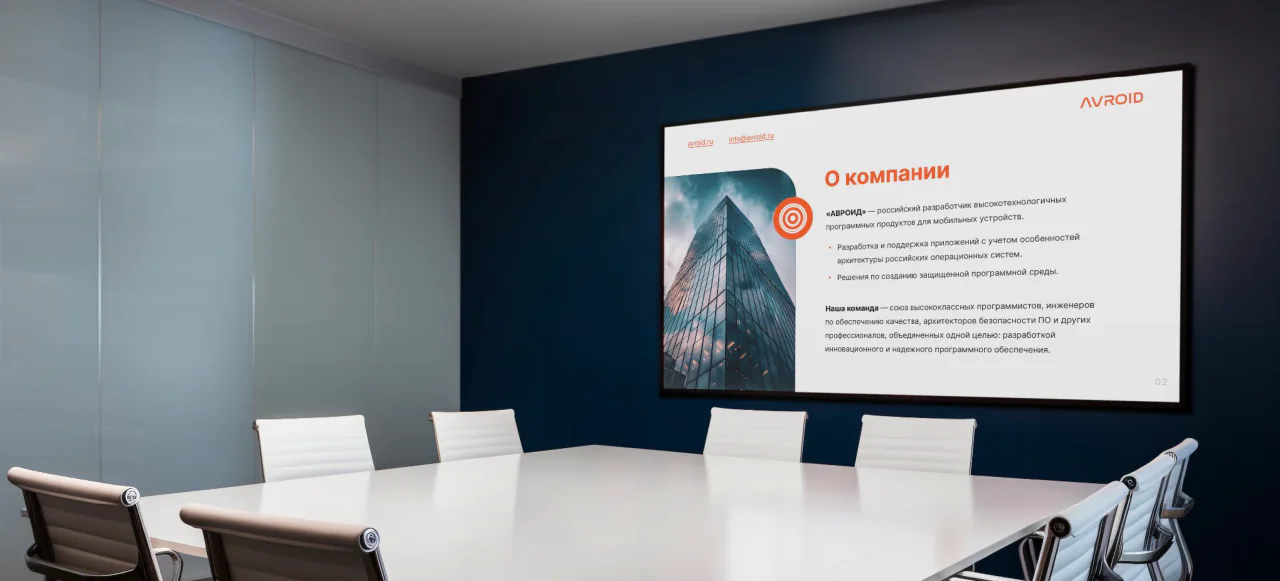
A document template and the presentation theme
For imagery, I trained an image-generation model on internal material only: my own 3D models and designs, plus a curated set of generated images. It fed presentation visuals and a large 3D icon library, and sped up production for me, the product designer and, under my direction, the marketing team. Internal material kept it inside the same licensing discipline as everything else.

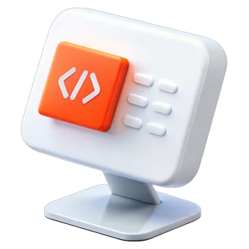

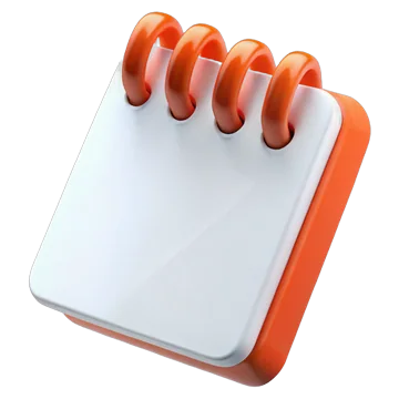

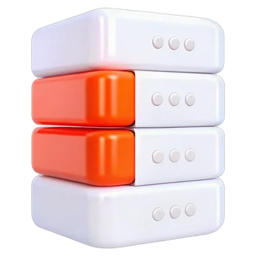



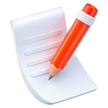


The 3D icon library, produced through the internally trained model
Three training programmes
Systems only work if people can use them, so I designed and delivered three programmes, open to the whole company: brand structure and materials; generative AI, cloud and local tooling; and the legal side of design and of the template system.
That last one came out of the work itself. I worked directly with legal counsel on stock licensing, fonts, images of people and buildings, third-party logos and state symbols, and on trademark and software registration filings, then wrote the lines down for everyone else.
05 — Product
The platform’s visual layer, and where my line was.
The platform’s visual system and graphic layer were mine: icons on the Aurora OS size grid, system app icons, splash screens, loading animations, in-app graphics, seasonal skins and production assets at every density. UX was shared with the other product designer, roughly equally. On app UI the other designer carried the larger volume; I designed a substantial number of screens alongside and joined at design reviews, visual decisions and wherever a more systemic solution was needed.
The product typeface, AvFlow, was part of that layer and unrelated to the logo work. It was built on Inter, under its SIL Open Font License: variable, Latin and Cyrillic, Regular and Bold. The reasons were practical: no external CDN dependency inside the product, a product that looked like itself rather than like every Inter interface, and letterforms that sat with the brand.
I was named as a co-author on the state software registration certificates for both products, across two successive releases of each, and brand marks I designed were filed and registered as trademarks by the company.
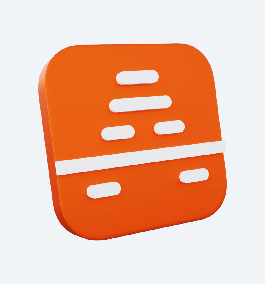



App icons and the AvFlow typeface
06 — What I’d change
The criteria I’d have set before starting.
I would fix the selection criteria before any concept work: fit to business objectives, recognisability, use in digital and print, accessibility, cost of implementation and legal constraints such as font licensing, and align them with stakeholders up front. It might not have changed the final design, but it would have cut iterations and made decisions easier to defend.